
The Enterprise Mobility Logo is one of the most recognized symbols in the global transportation and mobility industry. Behind this simple yet powerful visual mark lies a rich history, a carefully planned brand strategy, and a company that has grown from a small local business into a worldwide mobility leader. In this article, we explore what the Enterprise Mobility Logo represents, how it has evolved, the story behind the company, and why this logo matters to customers and the mobility sector.
What Is the Enterprise Mobility Logo?
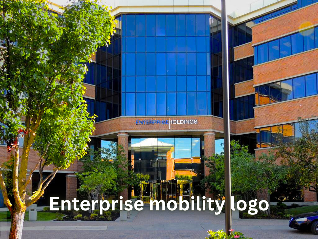
The Enterprise Mobility Logo serves as the official corporate symbol for Enterprise Mobility, the parent brand for some of the world’s largest mobility service providers, including Enterprise Rent‑A‑Car, National Car Rental, and Alamo Rent A Car. This logo is present in offices, on vehicles, across digital platforms, and in marketing materials, reflecting the company’s identity and commitment to service.
Originally, the company operated under Enterprise Holdings, but in 2023 it rebranded as Enterprise Mobility, signaling its expansion into a full suite of mobility solutions such as fleet management, vehicle subscriptions, and carsharing. The logo represents this transformation and serves as a visual promise to customers. (PR Newswire)
A Brief History of Enterprise Mobility
Founded in 1957 by Jack C. Taylor as the Executive Leasing Company in St. Louis, Missouri, the company initially focused on providing replacement vehicles for customers while their personal cars were being repaired. Over the years, it expanded into airport rentals, fleet services, and beyond. The Enterprise Mobility Logo has remained a symbol of the company’s growth and dedication to reliable service. (1000 Logos)
The “Enterprise” name was chosen in honor of the USS Enterprise, the aircraft carrier on which Jack Taylor served during World War II. Under his leadership and later that of his family, the company grew into North America’s largest car rental provider. The Enterprise Mobility Logo reflects that legacy and the company’s continued focus on customer-first service.
In 2009, Enterprise Holdings was created to manage multiple brands and operations, and in 2023, the rebranding to Enterprise Mobility introduced a refreshed logo that highlights the company’s broader mission. (PR Newswire)
Meaning Behind the Enterprise Mobility Logo
The Enterprise Mobility Logo is more than just a graphic—it symbolizes the company’s core values, including reliability, innovation, and forward motion. The stylized lowercase “e” conveys movement and continuity, paired with bold typography that emphasizes professionalism. Its green and blue color scheme communicates growth, environmental awareness, and trustworthiness. (Logos World)
This logo evolution mirrors the company’s journey from a traditional car rental business to a full-service mobility solutions provider serving businesses, governments, and consumers globally. The Enterprise Mobility Logo acts as a visual anchor for this expanded identity. (PR Newswire)
| Attribute | Details |
|---|---|
| Company Name | Enterprise Mobility |
| Founded | 1957 |
| Founder | Jack C. Taylor |
| Headquarters | St. Louis, Missouri, USA |
| CEO / Leadership | Chrissy Taylor (President & CEO), Andrew C. Taylor (Executive Chairman) |
| Employees | 90,000+ |
| Global Locations | 90+ countries |
| Fleet Size | 2.4 million+ vehicles |
| Net Worth / Revenue | $35+ billion annual revenue |
| Services | Car rental, fleet management, vehicle subscription, carsharing |
| Official Logo | Enterprise Mobility Logo |
The Evolution of the Enterprise Mobility Logo
Over the decades, the Enterprise Mobility Logo has evolved to match the company’s growth and modernization. While the original wordmark was simple and functional, the updated logo is dynamic, reflecting the company’s focus on innovation and mobility solutions. (Logos World)
This evolution mirrors Enterprise Mobility’s expansion from a small fleet in the 1950s to a global operation with millions of vehicles and nearly 9,500 locations worldwide. The Enterprise Mobility Logo visually ties these operations together, providing consistency across every touchpoint. (enterprisemobility.com)
Design Elements Explained
The Enterprise Mobility Logo incorporates three main design elements:
- Stylized “e”: Represents energy, enterprise, and movement, giving the logo a sense of forward motion.
- Color palette: Green signifies sustainability and growth, while blue conveys trust and reliability.
- Clean typography: Modern, sans-serif lettering ensures readability across platforms.
These elements combine to create a logo that is instantly recognizable, whether on a vehicle, website, or mobile application. (Logos World)
Why the Enterprise Mobility Logo Matters
The Enterprise Mobility Logo is central to brand recognition. Customers immediately associate it with trustworthy service, whether at rental counters, online, or on the road. This consistent visual identity ensures that Enterprise Mobility maintains a cohesive global presence, reinforcing trust in every market it serves. (enterprisemobility.com)
Additionally, the logo signals the company’s innovation and commitment to modern mobility, positioning Enterprise Mobility as more than just a traditional rental service. The Enterprise Mobility Logo conveys the brand’s promise to advance global transportation solutions. (PR Newswire)
Enterprise Mobility Today
Currently, Enterprise Mobility operates in over 90 countries, with a fleet exceeding 2.4 million vehicles and a workforce of 90,000 employees. Its offerings include car rentals, fleet management, vehicle subscriptions, carsharing, and commercial solutions. The Enterprise Mobility Logo unifies these services, making the brand instantly recognizable worldwide. (enterprisemobility.com)
Brand Values Reflected in the Logo
The Enterprise Mobility Logo embodies several core values:
- Customer-First Service: Communicates the brand’s commitment to customer satisfaction.
- Innovation: Reflects forward-thinking approaches to mobility solutions.
- Sustainability: The green accent signals environmental responsibility.
- Global Accessibility: Its simplicity ensures recognition across different markets. (Logos World)
How People Experience the Logo
Every day, millions of people encounter the Enterprise Mobility Logo, whether on a rental car, website, app, or airport counter. This exposure strengthens brand recall and fosters trust, even among those unfamiliar with the company’s corporate structure. The logo represents reliability, convenience, and modern mobility solutions. (enterprisemobility.com)
Brand Leadership and Legacy
Founded by Jack C. Taylor and now family-led by Chrissy Taylor and Andrew C. Taylor, Enterprise Mobility emphasizes strong corporate leadership and community engagement. The Enterprise Mobility Logo reflects this continuity, linking decades of innovation with the company’s modern vision. (Wikipedia)
Final Thoughts
The Enterprise Mobility Logo is more than a design; it represents the company’s journey, values, and vision for the future. From a small leasing business in 1957 to a global leader in mobility services, the logo has become a symbol of trust, innovation, and global presence.
As Enterprise Mobility continues to expand and innovate, the Enterprise Mobility Logo will remain a visual anchor, reminding customers and partners of the company’s commitment to moving the world forward, one journey at a time.
FAQs
Q1: What is the Enterprise Mobility Logo?
A: The Enterprise Mobility Logo is the official symbol representing Enterprise Mobility, used across its services, vehicles, and digital platforms.
Q2: Why is the Enterprise Mobility Logo important?
A: It builds brand recognition, trust, and consistency, helping customers identify Enterprise Mobility services worldwide.
Q3: What do the colors in the Enterprise Mobility Logo mean?
A: Green represents growth and sustainability, while blue signifies reliability and professionalism.
Q4: Has the Enterprise Mobility Logo changed over time?
A: Yes, it has evolved from a simple wordmark to a modern, dynamic design reflecting the company’s broader mobility services.
Q5: Where can I see the Enterprise Mobility Logo?
A: It appears on rental vehicles, office locations, mobile apps, websites, and marketing materials globally.